Create a Contour Plot of the Effect of a Continuous Covariate on the Survival Probability
plot_surv_contour.RdUsing a previously fit time-to-event model, this function creates a contour plot with the continuous covariate on the y-axis and the time-to-event on the x-axis. The color is made in accordance with the corresponding survival probability at that point, binned into separate categories. This is very similar to the plot_surv_heatmap plot, but using a categorical representation.
Usage
plot_surv_contour(time, status, variable, group=NULL,
                  data, model, cif=FALSE,
                  na.action=options()$na.action,
                  horizon=NULL, fixed_t=NULL, max_t=Inf,
                  size=0.1, linetype="solid", alpha=1,
                  bins=NULL, binwidth=NULL, breaks=NULL,
                  custom_colors=NULL,
                  xlab="Time", ylab=variable,
                  title=NULL, subtitle=NULL,
                  legend.title="S(t)", legend.position="right",
                  gg_theme=ggplot2::theme_bw(),
                  facet_args=list(),
                  panel_border=FALSE, axis_dist=0, ...)
Arguments
- time
A single character string specifying the time-to-event variable. Needs to be a valid column name of a numeric variable in
data.- status
A single character string specifying the status variable, indicating if a person has experienced an event or not. Needs to be a valid column name of a numeric or logical variable in
data.- variable
A single character string specifying the continuous variable of interest, for which the survival curves should be estimated. This variable has to be contained in the
data.framethat is supplied to thedataargument.- group
An optional single character string specifying a factor variable in
data. When used, the plot is created conditional on this factor variable, meaning that a facetted plot is produced with one facet for each level of the factor variable. Seecurve_contfor a detailed description of the estimation strategy. Set toNULL(default) to use no grouping variable.- data
A
data.framecontaining all required variables.- model
A model describing the time-to-event process (such as an
coxphmodel). Needs to includevariableas an independent variable. It also has to have an associatedpredictRiskmethod. See?predictRiskfor more details.- cif
Whether to plot the cumulative incidence (CIF) instead of the survival probability. If multiple failure types are present, the survival probability cannot be estimated in an unbiased way. This function will always return CIF estimates in that case.
- na.action
How missing values should be handled. Can be one of:
na.fail,na.omit,na.pass,na.excludeor a user-defined custom function. Also accepts strings of the function names. See?na.actionfor more details. By default it uses the na.action which is set in the global options by the respective user.- horizon
A numeric vector containing a range of values of
variablefor which the survival curves should be calculated orNULL(default). IfNULL, the horizon is constructed as a sequence from the lowest to the highest value observed invariablewith 40 equally spaced steps.- fixed_t
A numeric vector containing points in time at which the survival probabilities should be calculated or
NULL(default). IfNULL, the survival probability is estimated at 100 equally spaced steps from 0 to the maximum observed event time.- max_t
A number indicating the latest survival time which is to be plotted.
- size
The size of the individual lines plotted by the
geom_contour_filledfunction. Usually this option can be kept at 0.1 (default).- linetype
The linetype of the contour lines.
- alpha
The transparency level of the plot.
- bins
A single number specifying how many categories the survival probability or CIF should be divided in, or
NULL(default). IfNULL, the defaults ingeom_contour_filledare used.- binwidth
A single number specifying the width of the bins of the survival probability or CIF categories, or
NULL(default). IfNULL, the defaults ingeom_contour_filledare used.- breaks
A vector of specific breaks to create the survival probability or CIF bins, or
NULL(default). IfNULL, the defaults ingeom_contour_filledare used.- custom_colors
A character vector of custom colors that should be used for each contour area.
- xlab
A character string used as the x-axis label of the plot.
- ylab
A character string used as the y-axis label of the plot.
- title
A character string used as the title of the plot.
- subtitle
A character string used as the subtitle of the plot.
- legend.title
A character string used as the legend title of the plot.
- legend.position
Where to put the legend. See
?themefor more details.- gg_theme
A ggplot2 theme which is applied to the plot.
- facet_args
A named list of arguments that are passed to the
facet_wrapfunction call when creating a plot separated by groups. Ignored ifgroup=NULL. Any argument except thefacetsargument of thefacet_wrapfunction can be used. For example, if the user wants to allow free y-scales, this argument could be set tolist(scales="free_y").- panel_border
Whether to draw a border around the heatmap or not. Is set to FALSE by default to mimic standard heatmaps.
- axis_dist
The distance of the axis ticks to the colored heatmap. Is set to 0 by default to mimic standard heatmaps.
- ...
Further arguments passed to
curve_cont.
Details
Contour plots are a great way to reduce three dimensions to a two-dimensional plot and therefore lend themselves easily to plot the effect of continuous variable on the survival probability or CIF over time. Heatmaps (as available in the plot_surv_heatmap) function are very similar, but are often less clear then contour plots. The major downside of these plots is that they do not have the survival probability (or CIF) on the y-axis, which is of course the standard in standard Kaplan-Meier plots. A very similar plot but with the probability of interest on the y-axis can be created using the plot_surv_area function.
This type of plot has been described in Jackson & Cox (2021). However, the authors of that article propose a different method to estimate the needed data for the plot.
Internally, this function uses the geom_contour_filled function of the ggplot2 package to create the plot, after estimating the required probabilities using the curve_cont function.
References
Robin Denz, Nina Timmesfeld (2023). "Visualizing the (Causal) Effect of a Continuous Variable on a Time-To-Event Outcome". In: Epidemiology 34.5
Jackson, R. J. & Cox, T. F. Kernel Hazard Estimation for Visualisation of the Effect of a Continuous Covariate on Time-To-Event Endpoints Pharamaceutical Statistics, 2021
Examples
library(contsurvplot)
library(riskRegression)
library(survival)
library(ggplot2)
library(splines)
# using data from the survival package
data(nafld, package="survival")
# take a random sample to keep example fast
set.seed(42)
nafld1 <- nafld1[sample(nrow(nafld1), 150), ]
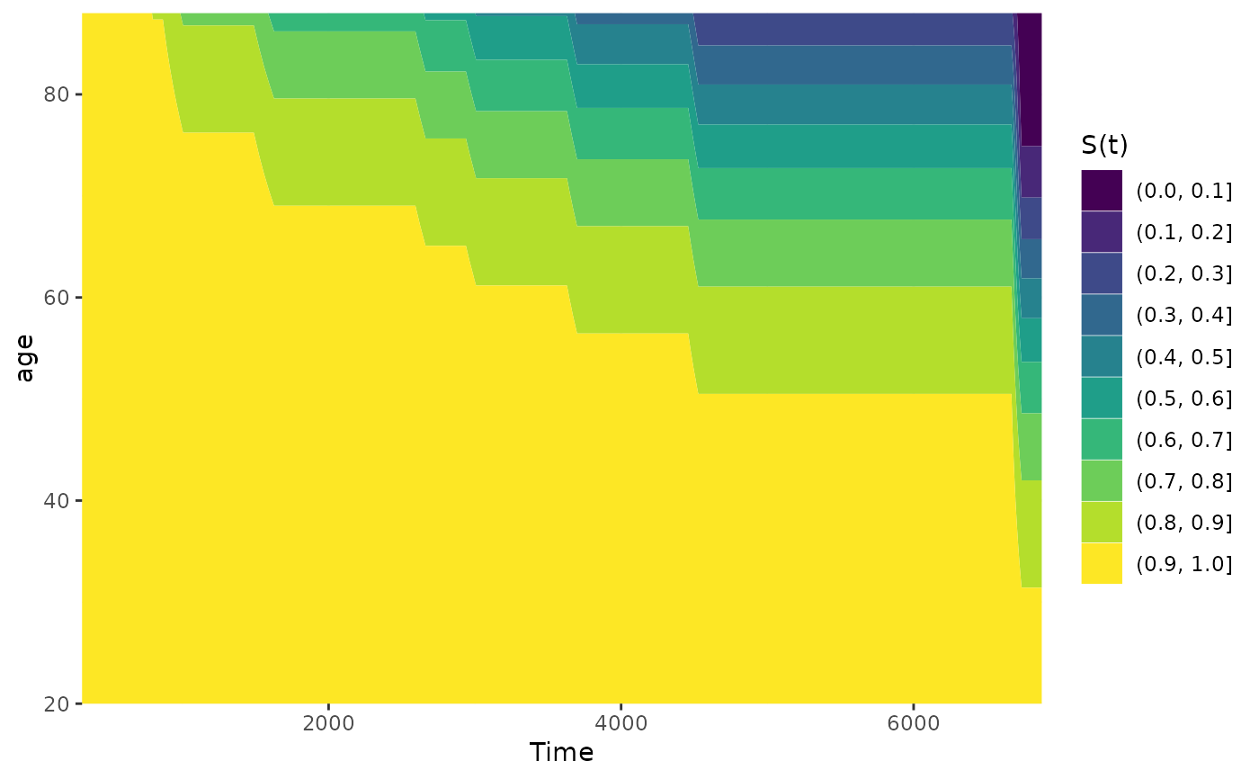
# fit cox-model with age
model <- coxph(Surv(futime, status) ~ age, data=nafld1, x=TRUE)
# plot effect of age on survival using defaults
plot_surv_contour(time="futime",
status="status",
variable="age",
data=nafld1,
model=model)
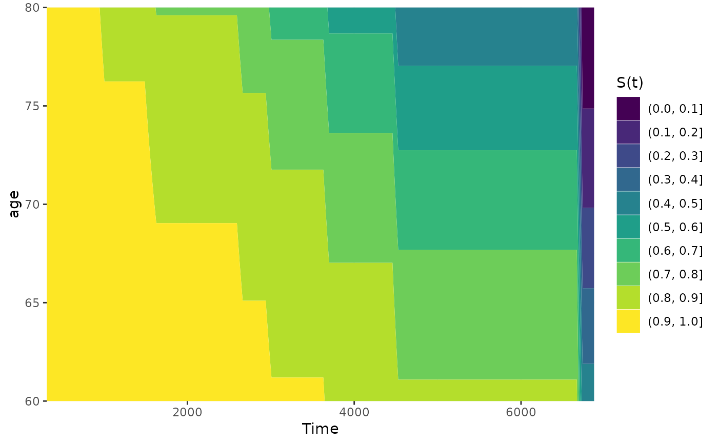
 # plot it only for 60 to 80 year old people
plot_surv_contour(time="futime",
status="status",
variable="age",
data=nafld1,
model=model,
horizon=seq(60, 80, 0.5))
# plot it only for 60 to 80 year old people
plot_surv_contour(time="futime",
status="status",
variable="age",
data=nafld1,
model=model,
horizon=seq(60, 80, 0.5))
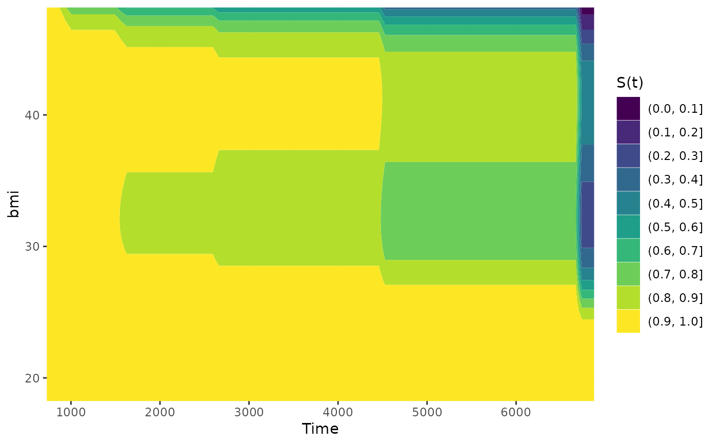
 ## showing non-linear effects
# fit cox-model with bmi modelled using B-Splines,
# adjusting for age and sex
model2 <- coxph(Surv(futime, status) ~ age + male + bs(bmi, df=3),
data=nafld1, x=TRUE)
# plot effect of bmi on survival using defaults
plot_surv_contour(time="futime",
status="status",
variable="bmi",
data=nafld1,
model=model2)
## showing non-linear effects
# fit cox-model with bmi modelled using B-Splines,
# adjusting for age and sex
model2 <- coxph(Surv(futime, status) ~ age + male + bs(bmi, df=3),
data=nafld1, x=TRUE)
# plot effect of bmi on survival using defaults
plot_surv_contour(time="futime",
status="status",
variable="bmi",
data=nafld1,
model=model2)